Branding & Responsive Website
Type
Client Project
Client
Tiny Me Home Daycare and Preschool
Role
Deliverables
Brand Identity
Visual System Responsive Website

Following the launch of Tiny Me’s new website, tour inquiries increased by 200%, enrollment reached full capacity within two weeks, and a waiting list of more than 30 families quickly formed.
From post-tour feedback, most new families first found the website through Google Maps and booked a tour after reviewing the information online.
This showed that the website was not only attracting interest, but also helping parents feel ready to reach out.
increase in tour inquiries
after launch
families joined the waiting list within weeks


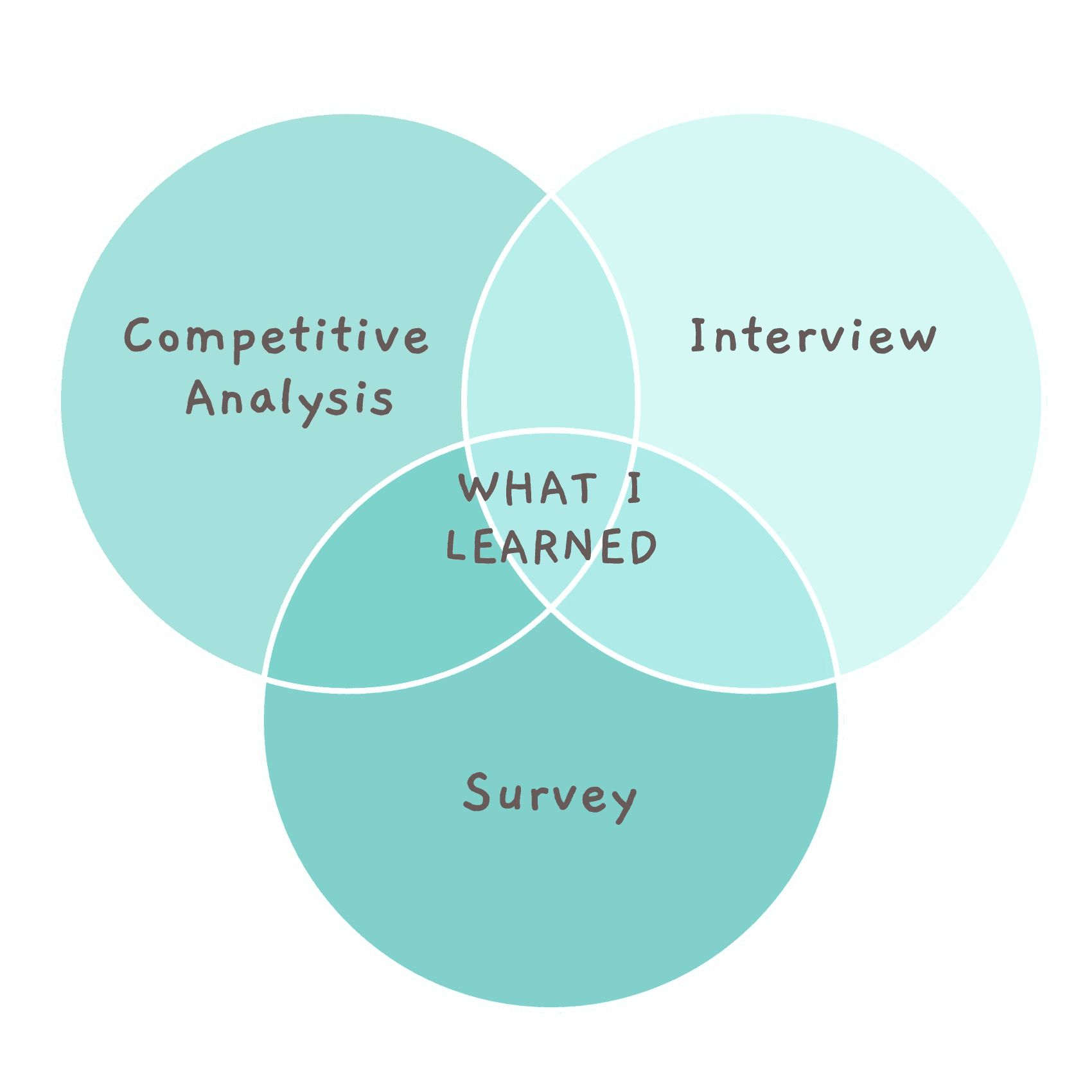


How Might We….
Organizing Website Content So Parents Can Find Answers Faster
Grouped by Program Structure: Prioritizes programs and curriculum, helping parents quickly understand what is taught and how learning is organized.
Grouped by Daily Schedule: Organizes content around a full-day flow, allowing parents to picture what their child’s day would actually look like.
Grouped by Trust Building: Leads with teachers, values, and daily moments to reassure parents before showing practical details.

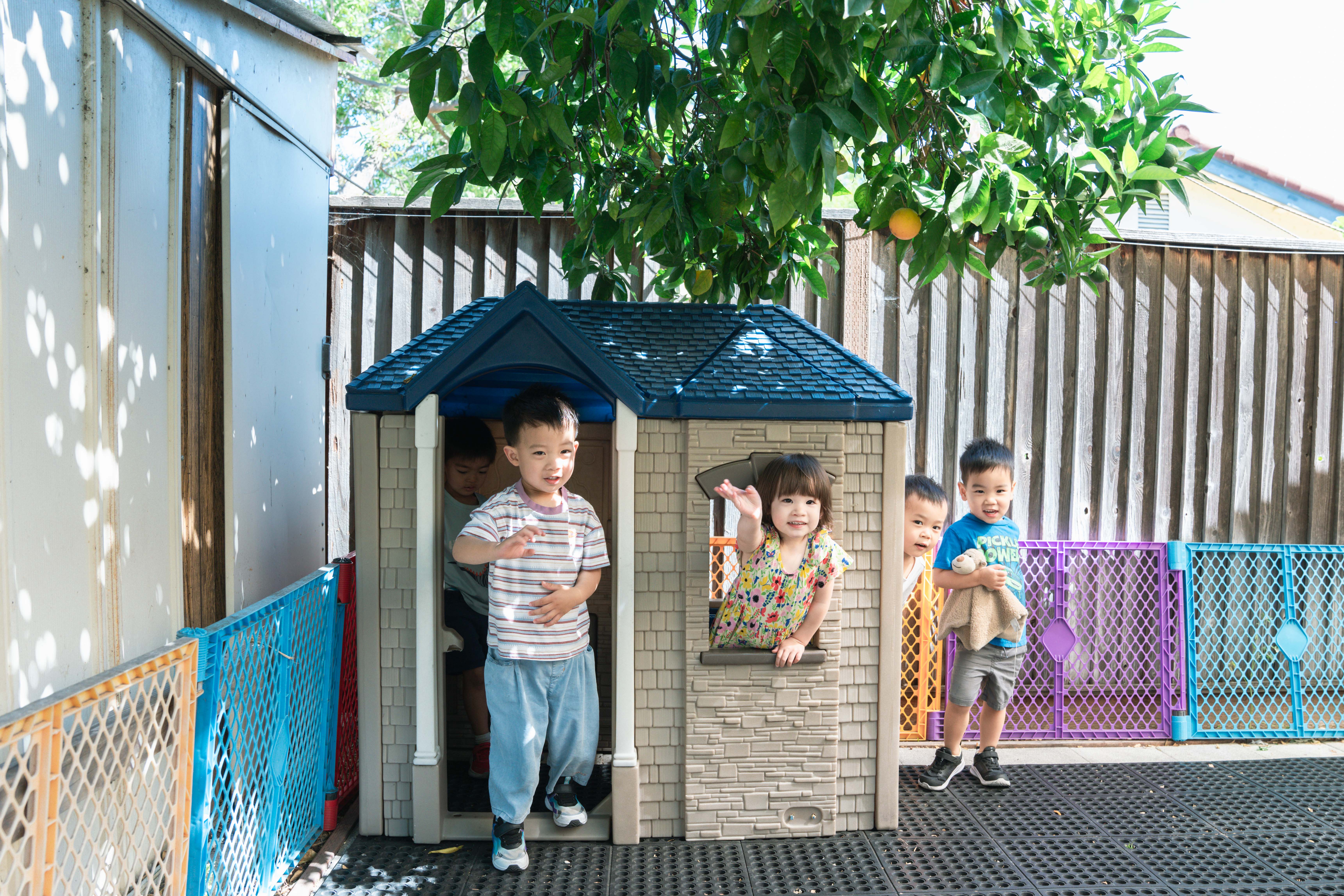
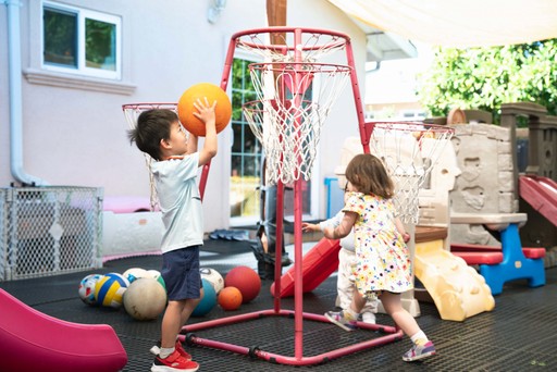
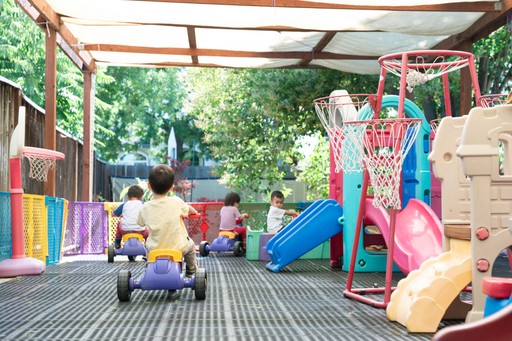
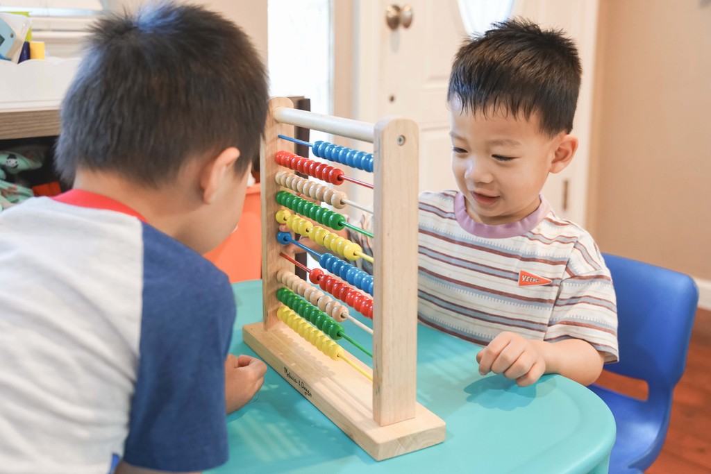
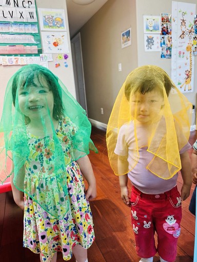
Planning Key Moments to Photograph for Trust Building


Exploring Ways to Explain What Makes Tiny Me Different


Shaping a Warm, Friendly Visual Identity


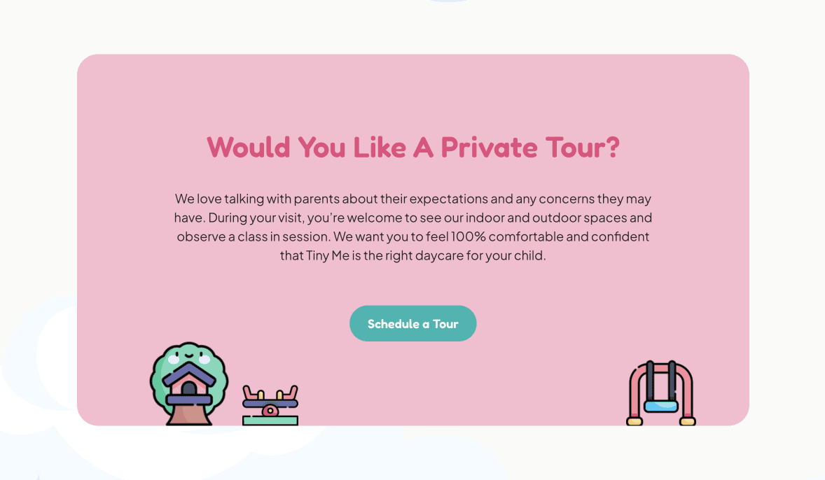
A Website Built Around Parents’ Decisions

The homepage answers parents’ first concern: “Can I trust this place with my child?” It introduces the founder, shows real parent feedback, and explains Tiny Me’s values, so parents can quickly feel comfortable before clicking deeper.
I created Why TinyMe as a dedicated page to give parents a clear, one-page answer to “Why should I choose this daycare?”
I grouped the information parents care about most directly into the main navigation, so key details are visible without extra clicking or digging.

A Brand That Feels Caring and Approachable
I designed the logo to be simple and friendly enough for young children to recognize, while still feeling professional to parents.


I chose bright teal, soft pastel pink, and warm neutrals to keep the site light, readable, and friendly—especially for parents browsing on their phones.


I selected the photos, icons, and UI elements to make the design feel warm, approachable, and playful—just like Tiny Me.
Following the launch of Tiny Me’s new website, tour inquiries increased by 200%, enrollment reached full capacity within two weeks, and a waiting list of more than 30 families quickly formed.
From post-tour feedback, most new families first found the website through Google Maps and booked a tour after reviewing the information online.
This showed that the website was not only attracting interest, but also helping parents feel ready to reach out.
increase in tour inquiries
after launch
families joined the waiting list within weeks