Branding & Responsive Website
Helping a Local Daycare Compete and Grow
Type
Client Project
Client
Tiny Me Home Daycare and Preschool
Role
End-to-End Product Design
Web Development
Deliverables
Brand Identity
Visual System Responsive Website

Challenge
For over a decade, Tiny Me grew through word of mouth and Facebook. Recently, local preschools began enrolling younger children, directly competing for Tiny Me's age group. Inquiries dropped sharply, signaling a need for change.
Goal
The goal of this project was to help the daycare build trust, improve visibility, stand out in a saturated market, and grow sustainably through an end-to-end website and brand redesign.
Results
Following the launch of Tiny Me’s new website, tour inquiries increased by 200%, enrollment reached full capacity within two weeks, and a waiting list of more than 30 families quickly formed.
From post-tour feedback, most new families first found the website through Google Maps and booked a tour after reviewing the information online.
This showed that the website was not only attracting interest, but also helping parents feel ready to reach out.
increase in tour inquiries
after launch
families joined the waiting list within weeks
Research
Key Questions
To guide the research, I focused on three core questions:
How do parents make decisions when choosing a daycare?
What information do they look for on a daycare website?
Where does Tiny Me stand out compared with nearby preschools?
Methods
To answer these questions, I combined multiple methods:

Survey
Survey with 15 prospective families to understand what new parents look for when evaluating a daycare.
Interviews
Interviews with the daycare owner and 5 current parents to uncover daily routines, expectations, and decision-making factors.
Competitive Analysis
Competitive analysis of 3 nearby early-education centers to identify what information competitors highlight and what Tiny Me lacks online.
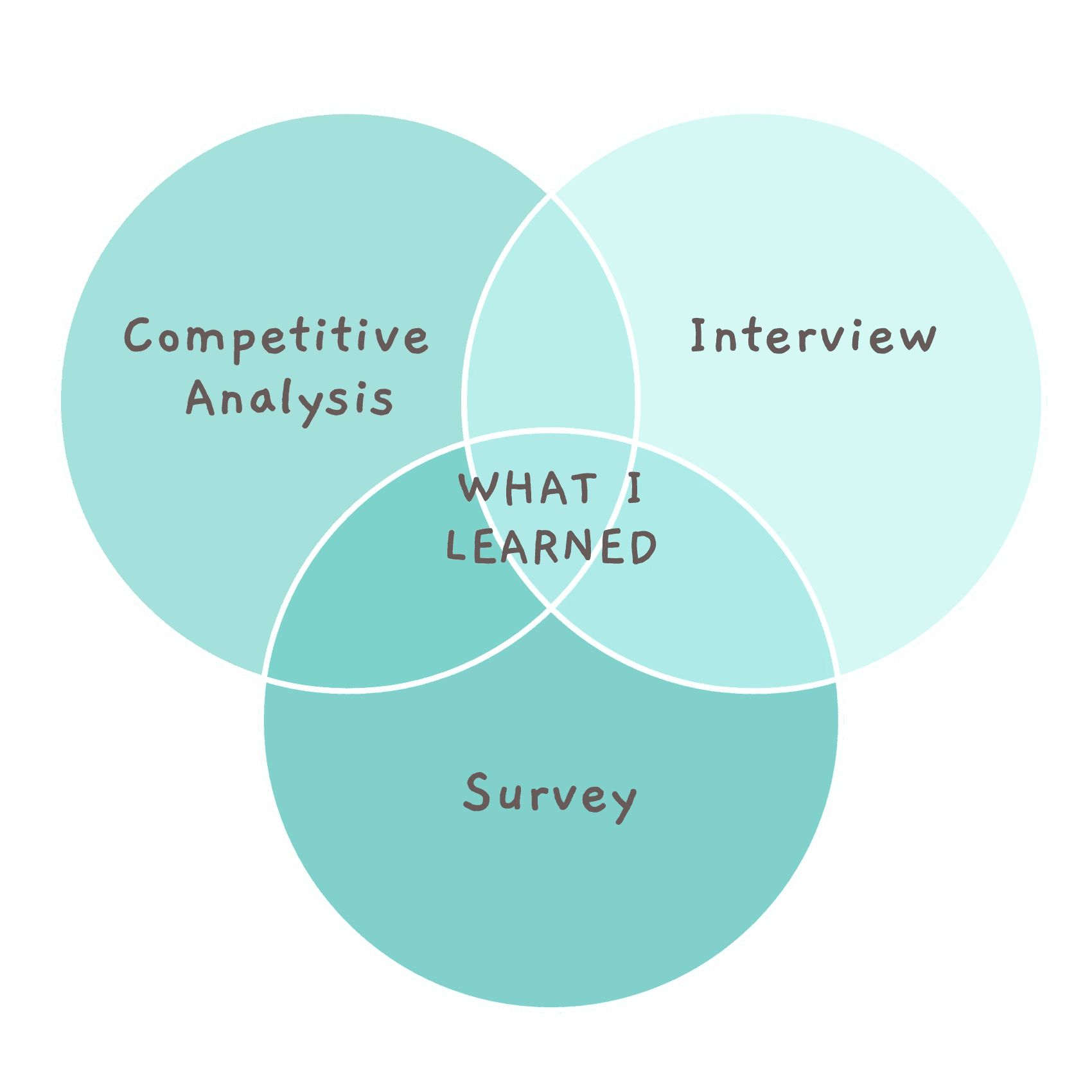
What I Learned

Parents need clarity fast.
They focus on whether their little one will be well cared for—looking at program details, daily routines, holidays, and safety—often within the first few seconds of browsing.

Trust drives the final decision.
Warm, experienced teachers and a safe, stable environment are the most influential factors.

Tiny Me’s strengths aren’t easy to find online.
Its experienced and caring teachers, engaging daily activities, and warm, family-like environment weren’t being communicated online.

Parents rely heavily on authentic visuals.
Real photos of everyday moments help parents imagine their child’s experience and feel reassured.

Problem Statement
New parents couldn’t quickly understand Tiny Me’s strengths or values online. Without clear information, authentic visuals, or a strong caring brand presence, families struggled to build trust and find answers easily—resulting in fewer inquiries and repeated questions for the owner.
Ideation
How Might We….
I turned research findings into 4 clear How Might We questions, then used them to make specific design decisions about site structure, page layouts, content priorities, and visual direction.
How might we organize key information so parents can quickly understand whether Tiny Me is the right fit?
How might we help parents feel reassured about daily care before visiting in person?
How might we help new parents quickly understand what makes Tiny Me different?
How might we express Tiny Me’s warm, family-like brand in a clear, modern way online?
Organizing Website Content So Parents Can Find Answers Faster
To reduce repeated questions from parents and help them decide whether to book a tour, I explored 3 early sitemap structures focused on a different parent mindset:
Grouped by Program Structure: Prioritizes programs and curriculum, helping parents quickly understand what is taught and how learning is organized.
Grouped by Daily Schedule: Organizes content around a full-day flow, allowing parents to picture what their child’s day would actually look like.
Grouped by Trust Building: Leads with teachers, values, and daily moments to reassure parents before showing practical details.

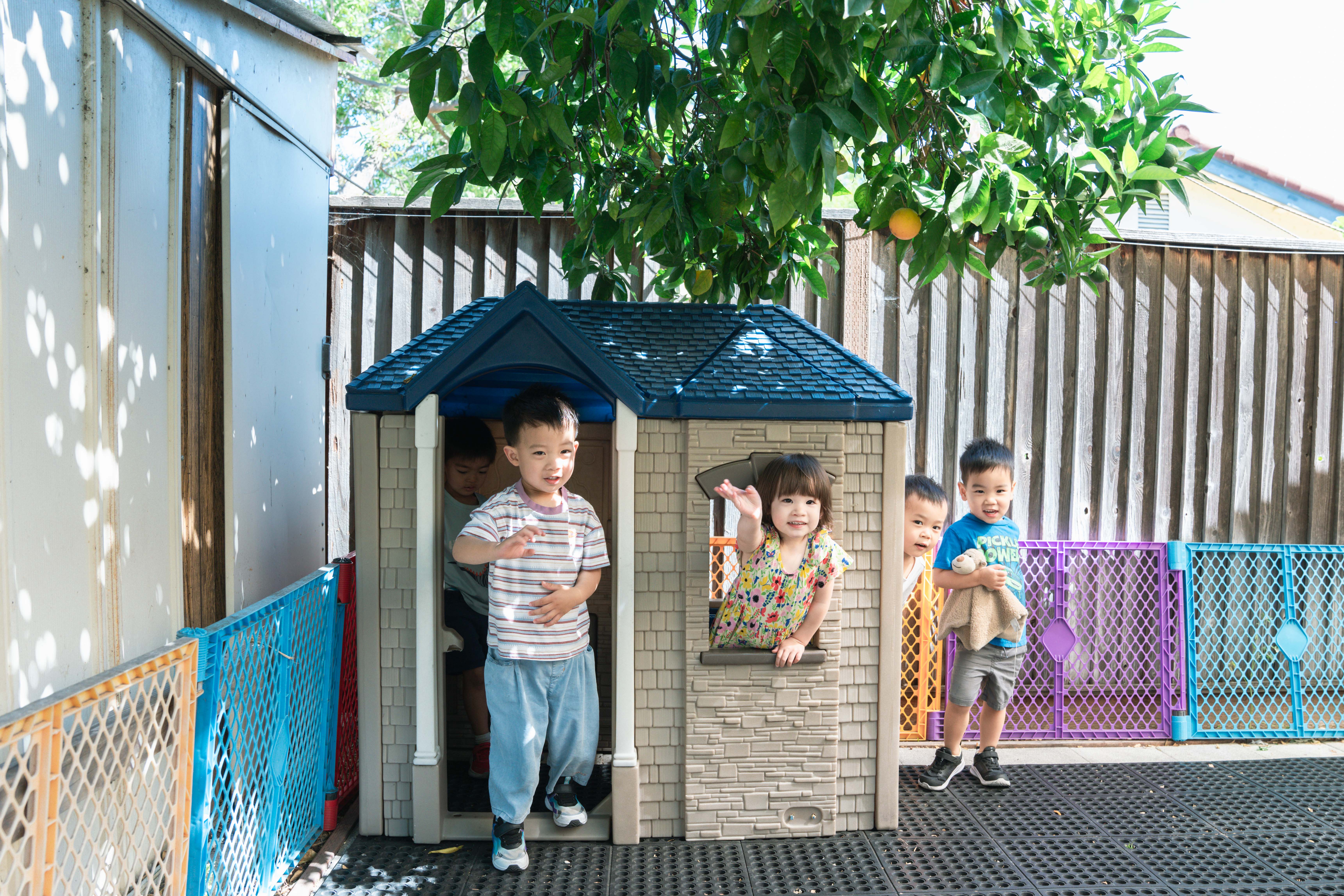
Planning Key Moments to Photograph for Trust Building
I planned specific daily moments to photograph and used a moodboard to set a warm, caring tone, helping parents see what daily life at the daycare truly feels like.


Exploring Ways to Explain What Makes Tiny Me Different
To help parents quickly understand Tiny Me’s strengths, I sketched multiple homepage layout variations and headline options.


Shaping a Warm, Friendly Visual Identity
To reflect Tiny Me’s personality, I explored logo concepts, color palettes, typography, and illustration styles. I wanted a visual system that feels:
friendly and welcoming,
playful but not childish,
clear and trustworthy for parents.


Solution
A Website Built Around Parents’ Decisions
I designed the final sitemap around the factors parents consider when deciding whether to book a tour.

The homepage answers parents’ first concern: “Can I trust this place with my child?” It introduces the founder, shows real parent feedback, and explains Tiny Me’s values, so parents can quickly feel comfortable before clicking deeper.
I created Why TinyMe as a dedicated page to give parents a clear, one-page answer to “Why should I choose this daycare?”
I grouped the information parents care about most directly into the main navigation, so key details are visible without extra clicking or digging.
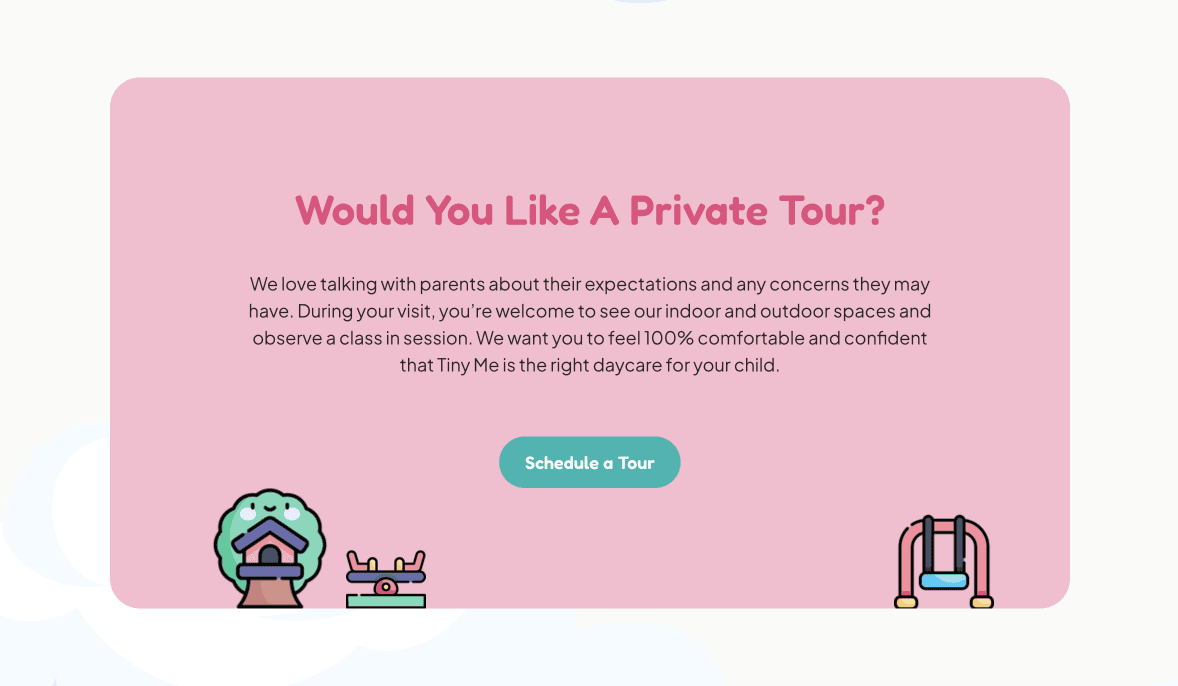
I placed a clear “Schedule a Tour” CTA on every page so parents can book the moment they feel ready, without needing to search or go back to the homepage.
View the Live Tiny Me Website
A Brand That Feels Caring and Approachable
I designed the logo to be simple and friendly enough for young children to recognize, while still feeling professional to parents.


I chose bright teal, soft pastel pink, and warm neutrals to keep the site light, readable, and friendly—especially for parents browsing on their phones.


I selected the photos, icons, and UI elements to make the design feel warm, approachable, and playful—just like Tiny Me.
Results
Following the launch of Tiny Me’s new website, tour inquiries increased by 200%, enrollment reached full capacity within two weeks, and a waiting list of more than 30 families quickly formed.
From post-tour feedback, most new families first found the website through Google Maps and booked a tour after reviewing the information online.
This showed that the website was not only attracting interest, but also helping parents feel ready to reach out.
increase in tour inquiries
after launch
families joined the waiting list within weeks
Final Thoughts
Communicating the “Why”
This project taught me how important it is to clearly explain the reasoning behind each design decision, especially when working with clients who don’t have a design background. Being able to communicate the “why” helped build trust and alignment throughout the process.
Designing with Empathy
Through conversations with the owner and parents, I realized how much empathy shapes the outcome of a project. Involving parents early and listening to their experiences made the final solution more meaningful and grounded in real needs.
Less is More
I discovered that offering a small number of thoughtful design options helps clients make confident decisions without feeling overwhelmed. Clear, focused choices can support a smoother and more collaborative decision-making process.

Previous
Project
Next
Project